1860 census map of slave populations in the South
Meta Title: 1860 Census Slave Population Map: Revealing the South’s Demographics Before the Civil War
Meta Description: Explore the 1860 U.S. Census map of enslaved populations in the Southern states. Learn about its historical significance, key findings, and how it shaped America’s antebellum era.
The 1860 Census Slave Population Map: A Window into the Antebellum South
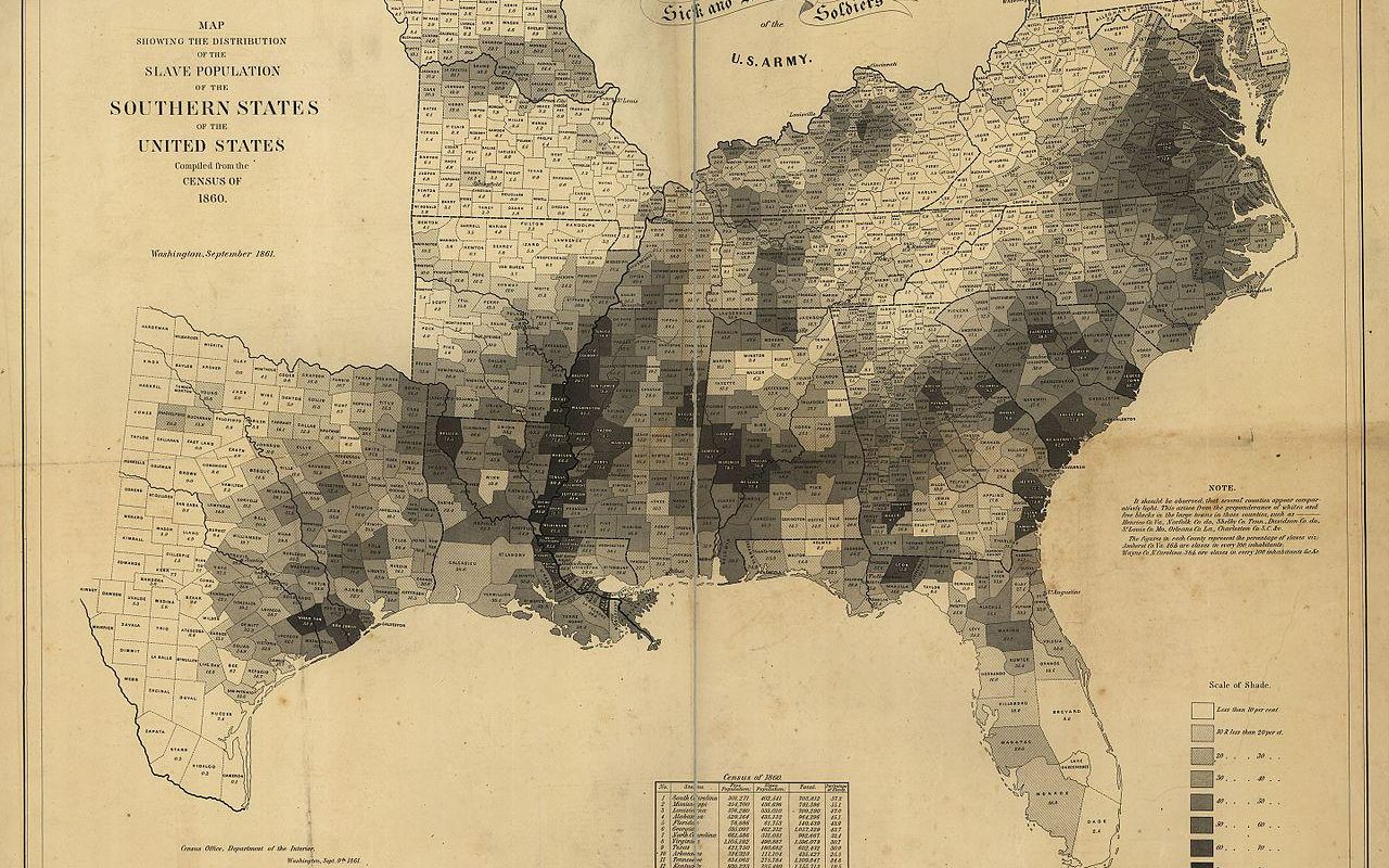
The 1860 U.S. Census slave population map is one of the most striking visual records of America’s antebellum era. Created on the brink of the Civil War, this document quantified and geographically mapped the distribution of enslaved people across the Southern states. It remains a critical resource for understanding slavery’s economic, social, and political impact on American history.
What Was the 1860 Census Slave Population Map?
The U.S. Census Bureau conducted its eighth decennial census in 1860, which included detailed data on enslaved populations in Southern states. Cartographers later transformed this data into thematic maps, shading counties based on the density of enslaved inhabitants. These maps revealed stark patterns:
- Total Enslaved Population: 3,953,760 enslaved individuals (roughly 13% of the U.S. population).
- Regional Hotspots: High concentrations in the “Black Belt” (fertile soil regions stretching from South Carolina to Texas) and along the Mississippi River.
- County-Level Insights: Some counties in Mississippi and South Carolina had enslaved populations exceeding 50–75% of residents.
Key States in the 1860 Slave Map
The census highlighted extreme disparities:
- Mississippi: Led the nation with 55% of its population enslaved.
- South Carolina: 57% enslaved statewide; coastal counties like Charleston averaged 80–90%.
- Louisiana: Enslaved laborers powered the lucrative sugar and cotton industries.
- Georgia, Alabama, & Virginia: Combined, these states held 45% of all enslaved people.
Why Was This Census Significant?
1. Fueling Sectional Tensions
The map visualized the South’s economic dependence on slavery—especially cotton, which accounted for 60% of U.S. exports in 1860. It amplified debates over slavery’s expansion into western territories.
2. A Catalyst for War
The data became a political lightning rod. Southern leaders feared losing power with rising Northern populations, while abolitionists leveraged the map to expose slavery’s brutality.
3. Documenting Human Impact
Beyond numbers, the map reflected the trauma of forced migration: over 1 million enslaved people were sold between states from 1810–1860.
How to Interpret the 1860 Slave Map Today
Modern historians use this map to:
- Track forced migration patterns to cotton-growing frontiers.
- Analyze wealth distribution: Plantation owners (who enslaved 20+ people) controlled most political power.
- Contextualize resistance, such as rebellions rooted in high-density slave areas.
Image: Shaded counties denote concentrations of enslaved populations. Source: U.S. Census Bureau.
Where to Find the 1860 Census Slave Map
Digitized versions are accessible through:
- National Archives: Original census manuscripts and cartographic records.
- Library of Congress: High-resolution scans of the map.
- University-based archives: e.g., University of Virginia’s Historical Census Browser.
FAQs About the 1860 Slave Population Map
Q: Why was Mississippi’s enslaved population so high?
A: Mississippi’s fertile Delta land became the epicenter of cotton production after Native American removal in the 1830s.
Q: Did all Southern states rely equally on slavery?
A: No—border states like Missouri (10% enslaved) lagged behind the Deep South.
Q: How accurate was the census?
A: Enslavers self-reported data, likely undercounting enslaved people to avoid taxes.
The Legacy of the 1860 Slavery Map
The 1860 census map is more than a historical artifact—it’s a testament to slavery’s entrenchment in America’s economic and cultural fabric. By overlaying this data with Civil War battlefields, emancipation trends, and Reconstruction policies, scholars continue to uncover how slavery shaped modern America.
Further Research: Pair the map with narratives from the Federal Writers’ Slave Narratives Project or explore Emancipation Proclamation impacts post-1863.
Keywords for SEO: 1860 census map, slave population map, antebellum South, Southern slavery statistics, Civil War demographics, Black Belt slavery, historical census data, enslaved population distribution.
Unlock a deeper understanding of America’s past with the 1860 census slave map—a vital tool for historians and educators alike.