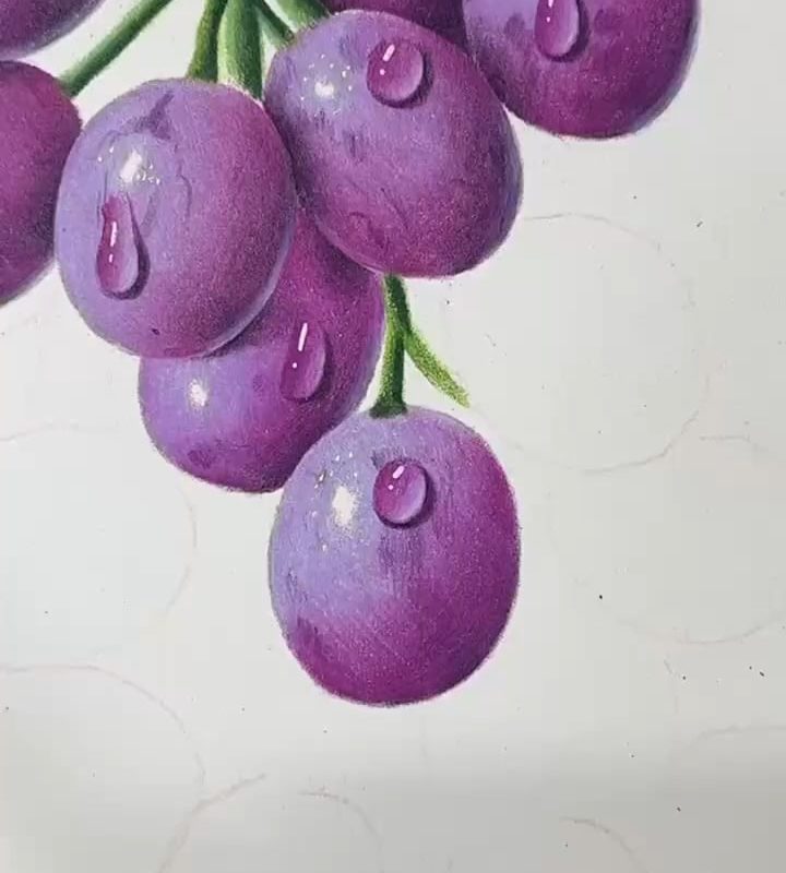
Source was an art aggregator account, OG artist is Henggu on Douyin
Title: How to Create a Stunning Hyperrealistic Grape Pencil Drawing: A Step-by-Step Guide
Meta Description: Learn how to draw a hyperrealistic grape with pencil using expert shading techniques, texture tips, and step-by-step instructions. Perfect your artistic skills and wow your audience!
The Art of Hyperrealism: Capturing Grapes in Pencil
Hyperrealistic pencil drawings captivate viewers with their extraordinary attention to detail and lifelike quality. Among the most popular subjects are fruits like grapes, whose intricate textures, translucent skin, and subtle color variations offer a perfect challenge for artists. In this guide, you’ll discover how to draw a hyperrealistic grape using graphite pencils, blending tools, and expert techniques to create jaw-dropping realism.
Why Grapes Are Perfect for Hyperrealistic Practice
Grapes are ideal for hyperrealism because they feature:
- Complex textures: Waxy skins with highlights and faint blemishes.
- Subtle color gradients: From deep purples to soft greens (depending on the variety).
- Organic shapes: Clusters with overlapping forms that test your shading and composition skills.
- Light interplay: Translucency that creates delicate reflections and shadows.
Whether you’re a beginner or an advanced artist, mastering a grape drawing will sharpen your observation skills and elevate your pencil work.
Materials You’ll Need
- Graphite pencils: Ranges from 2H (light) to 8B (dark) for dynamic contrast.
- Paper: Smooth, heavyweight paper (e.g., Bristol Board, 180+ gsm) to handle fine details.
- Blending tools: Tortillons, blending stumps, or soft tissue for seamless shading.
- Eraser: Kneaded eraser for lifting highlights; precision eraser for fine details.
- Reference photo: Use high-resolution images of grapes under natural light.
Step-by-Step: Drawing a Hyperrealistic Grape
1. Sketch the Outline Lightly
- Start with a faint outline using a 2H pencil. Focus on the grape’s circular shape, but avoid perfect symmetry—real grapes have slight irregularities.
- Include the stem’s thin curve and any overlapping grapes if drawing a cluster.
2. Layer the Base Shading
- Identify the light source (e.g., top-left) to plan your shadows.
- Apply light, even layers with a 2B pencil to block in mid-tones, avoiding highlighted areas (e.g., the grape’s top curve).
3. Build Depth with Shadows
- Use a 4B pencil to darken the grape’s underside and areas near the stem.
- Create “bloom” (the whitish haze on grape skin) by leaving subtle gaps in the shading or gently erasing selectively.
4. Refine Texture and Highlights
- Skin texture: Grapes have micro-bumps and faint ridges. Use a sharp 2H pencil to draw tiny, irregular circles or dashes.
- Highlight magic: Preserve the brightest highlights (e.g., reflections) untouched or lift graphite with a kneaded eraser.
5. Master the Stem and Details
- The stem is matte and fibrous. Use short, directional strokes with a 4B pencil to mimic its rough texture.
- Add tiny ridges at the stem’s base where it meets the grape for authenticity.
6. Soften and Blend
- Use a blending stump to smooth gradients on the grape’s body but avoid over-blending—texture is key.
- Deepen shadows with a 6B pencil and re-sharpen highlights for contrast.
5 Pro Tips for Hyperrealistic Success
- Zoom In on Your Reference: Study grape skin under magnification to see the speckles and wax patterns.
- Layer Slowly: Hyperrealism thrives on patience. Build up 5–7 layers for rich, dimensional tones.
- Control Your Pressure: Lighten your touch for highlights; press firmly only in the darkest crevices.
- Embrace Imperfections: Add minor blemishes (e.g., dots, scratches) to avoid an artificial look.
- Background Matters: A softly shaded backdrop makes the grape “pop” off the page.
Common Mistakes to Avoid
- Over-blending: This flattens the grape’s spherical form. Leave some pencil strokes visible.
- Ignoring Color Values: Even in grayscale, purple grapes appear darker than green ones. Adjust shading accordingly.
- Rigid Outlines: Real grapes have blurred edges. Use shading to define boundaries, not harsh lines.
Inspiration from Hyperrealism Masters
Artists like Diego Fazio and Kelvin Okafor exemplify hyperrealistic mastery. Analyze their work to see how they:
- Use extreme contrast to amplify depth.
- Balance detail with tonal harmony.
- Convey the “juicy” feel of fruit through meticulous light rendering.
Final Thoughts
Creating a hyperrealistic grape pencil drawing demands patience, observation, and layered shading—but the results are worth it. Practice regularly, experiment with textures, and soon you’ll be crafting artwork that looks almost edible!
Ready for more? Dive into tutorials on hyperrealistic water droplets or wine glasses to pair with your grape masterpiece!
Keywords for SEO:
Hyperrealistic grape drawing, pencil drawing tutorial, realistic grape sketch, graphite shading techniques, hyperrealism art guide, step-by-step pencil drawing, fruit drawing tips, blending graphite, texture drawing.
By focusing on technique, texture, and light, this guide helps artists unlock the secrets to mesmerizing hyperrealism—one grape at a time! 🍇✏️