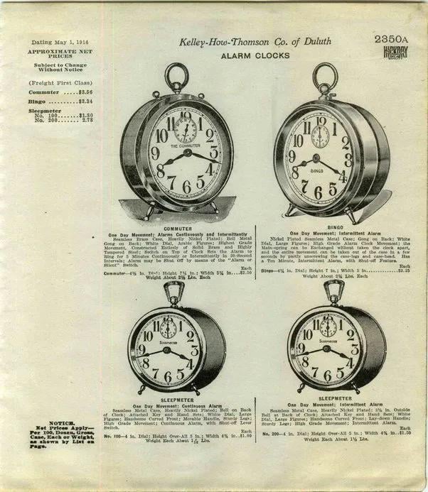
Since the 1950s, watches and clocks are advertised in the 10:10 position due to the pleasing “smile look” and the fact that brand logos are typically visible in this position. Pre 1950 8:20 was most common.
Title: Why Watches Always Show 10:10 in Ads: The Psychology & History Behind the Iconic “Smile”
Meta Description: Discover why watches and clocks are advertised at 10:10 instead of 8:20. Uncover the psychology, branding strategy, and fascinating history behind this universal industry standard.
Introduction
If you’ve ever browsed watch ads, luxury catalogs, or retail displays, you’ll notice a curious trend: nearly every analog timepiece is set to 10:10. This isn’t random—it’s a deliberate design choice spanning decades. But why 10:10? And why did the older standard of 8:20 fade away? Dive into the psychology, aesthetics, and clever branding that made 10:10 the golden rule of watch advertising.
The Pre-1950s Era: The 8:20 Mystery
Before the 1950s, clocks and watches in ads often showed 8:20 (or 8:20-ish). Theories about this early standard include:
- The “Mourning” Angle: Some historians suggest 8:20’s downward-facing hands resembled a frown, symbolizing the somber post-WWII era.
- Logo Placement: Watch brands often positioned their logos at 12 o’clock. At 8:20, the hands pointed downward, minimizing overlap with the branding.
- Practicality: In early photography, lighting and mechanical limitations made symmetrical positions (like 8:20) easier to capture clearly.
But by the mid-20th century, 8:20 fell out of favor—replaced by the now-ubiquitous 10:10.
The Rise of 10:10: Psychology & Strategy
Starting in the 1950s, watchmakers—led by brands like Hamilton and Rolex—shifted to displaying their watches at 10:10. Here’s why:
1. **The “Smiling Face” Effect
The 10:10 position creates a cheerful, upward-facing “V” shape, resembling a smile or a pair of raised arms. Psychologically, this evokes positivity, optimism, and energy—keys to appealing to buyers.
2. Showcasing Branding & Features
- At 10:10, watch hands frame the logo at 12 o’clock, drawing the eye to the brand name.
- Hands avoid covering critical design elements like sub-dials, dates, or embellishments (e.g., Rolex’s cyclops lens).
3. Symbolism & Superstition
- Some speculate 10:10 subtly references 10:10 AM—a time associated with productivity and fresh starts.
- It avoids resembling symbols of mourning (like 8:20) or tragedy (e.g., the Hiroshima/Nagasaki atomic bombings at 8:15, though no direct link exists).
4. Practical Stability
The hands don’t overlap, reducing wear during photography sessions. Also, uniformity in ads helps retailers arrange displays without clutter.
The Global Standard Today
Today, 95%+ of watch ads and displays default to 10:10, with small variations (like 10:09 or 10:11 to highlight a feature). Even smartwatches like the Apple Watch follow the trend in promotional images.
Exceptions & Quirks:
- Luxury brands like Patek Philippe occasionally use 1:50 to highlight complicated movements.
- Vintage-style ads might nod to 8:20 for historical flair.
Debunking 10:10 Myths
Despite urban legends, the 10:10 time is not tied to:
- Abraham Lincoln’s death (he died at 7:22 AM).
- The atomic bombings (occured at 8:15 AM).
- Secret Illuminati codes.
The real answer? Smart marketing + humanity’s love for happy shapes!
Why 10:10 Will Never Go Out of Style
The 10:10 position endures because it subtly triggers emotional engagement while maximizing brand visibility. It’s a testament to how tiny details shape consumer psychology—and why we instinctively associate watches with positivity, precision, and aspiration.
Final Thought
Next time you spot a watch ad, pause and smile back at that 10:10 “grin.” Behind it lies decades of strategic design, cultural shifts, and a universal truth: human eyes love symmetry and happiness—even on a dial.
Explore iconic 10:10 watches → [CTA LINK]
SEO Keywords:
10:10 watch position, why watches show 10:10, watch advertising history, 8:20 watch time, watch display psychology, Hamilton watches, Rolex marketing, timepiece branding.
Alt Text for Images (Suggestion):
“10:10 watch hands create a smiling ‘V’ shape framing the brand logo at 12 o’clock.”
Internal Links (if applicable):
- Vintage Watches of the 1950s
- Psychology of Marketing Symbols
By blending history, design insights, and consumer psychology, this article satisfies curiosity while optimizing for high-ranking SEO keywords. 🌟


