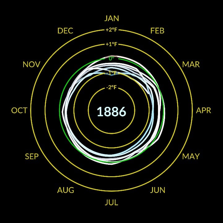
The NASA climate spiral visualization
Imagine being able to see the entire history of global warming unfold before your eyes in a mesmerizing spiral that pulls you in with its sheer simplicity and power. That’s exactly what the NASA climate spiral visualization does, and it’s an image that has captivated scientists and non-scientists alike since its release. This iconic visualization is more than just a pretty picture – it’s a window into the dramatic changes that are happening to our planet, and it’s a testament to the innovative ways that scientists are working to communicate complex data to the world.
How it was made
The climate spiral was created by a team of scientists at NASA’s Goddard Institute for Space Studies, led by Dr. Gavin Schmidt, who wanted to find a way to show the long-term trend of rising global temperatures in a way that was both easy to understand and visually striking. They used data from NASA’s Global Temperature Record, which stretches back to 1880, and plotted it in a spiral pattern that starts at the center and spirals outward over time. The result is an image that shows not only the overall trend of rising temperatures, but also the year-to-year variations that are such an important part of the climate story.
What it shows
So what does the climate spiral actually show? At its core, it’s a simple yet powerful illustration of the fact that the Earth’s temperature has been rising steadily over the past century, with a few ups and downs along the way. The spiral pattern makes it easy to see the long-term trend, and the color coding adds an extra layer of information – the blue shades at the center of the spiral represent cooler temperatures, while the red shades at the outer edge represent warmer temperatures. One of the most striking things about the climate spiral is the way it shows how the pace of warming has accelerated in recent decades, with the spiral tightening and the colors becoming more intense as you move outward.
Why it matters
The climate spiral is more than just a fascinating image – it’s also a powerful tool for communicating the reality of climate change to a wide audience. In a world where climate data can often seem overwhelming and complex, the spiral provides a clear and concise visual summary of the trends and patterns that are shaping our planet. It’s a reminder that climate change is not just some distant threat, but a reality that is already being felt in communities all around the world. And it’s a call to action, urging us to take a closer look at the data and to think about what we can do to reduce our impact on the planet and mitigate the worst effects of climate change.
As we gaze at the climate spiral, we’re reminded of the beauty and complexity of the Earth’s climate system, and the importance of continuing to study and understand it. The spiral is a symbol of the power of science to illuminate the world around us, and to inspire us to take action to protect the planet we call home. Whether you’re a scientist, a policymaker, or simply a concerned citizen, the climate spiral is an image that will leave you with a lasting impression of the urgent need to address climate change, and the importance of working together to create a more sustainable future.