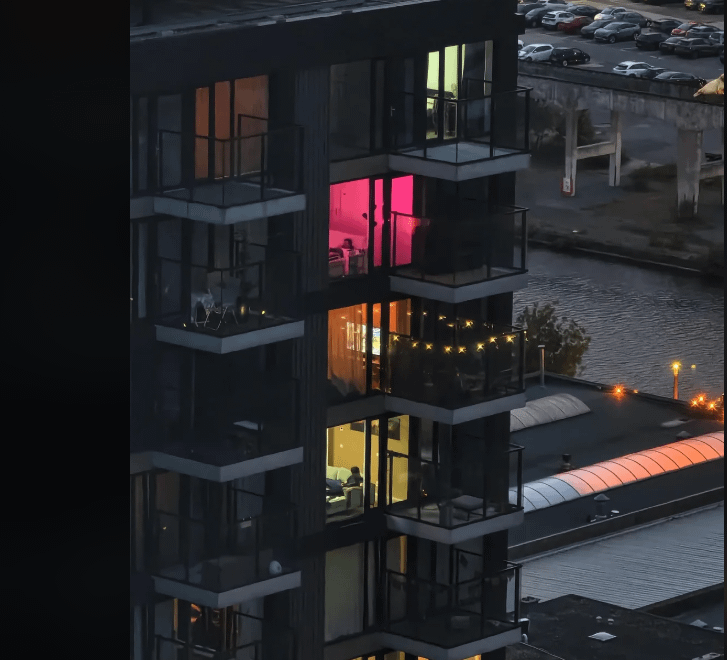
the colour gradient of these 3 apartments
As I stepped into each of these three apartments, I was immediately struck by the unique colour gradients that seemed to dance across the walls, floors, and ceilings. It was as if the designers had carefully crafted a visual journey, weaving together a tapestry of hues that not only reflected the personality of the space but also told a story of their own. From the soft, serene tones of the first apartment to the bold, vibrant colours of the second, and finally, to the rich, earthy shades of the third, I found myself drawn into a world of colour and light, eager to uncover the secrets behind these stunning gradients.
The Art of Transition
The first apartment’s colour gradient was a masterclass in subtlety, with gentle transitions from creamy whites to pale greys, and finally, to soft blues. This soothing palette was not only calming to the eye but also created a sense of continuity, drawing the viewer’s gaze effortlessly from one room to the next. As I delved deeper into the design process, I discovered that the gradient was carefully planned to mimic the shifting hues of a sunset, with each colour blending seamlessly into the next to create a sense of depth and dimension. The result was a space that felt both peaceful and expansive, as if the colours themselves were breathing life into the rooms.
The Science of Perception
The second apartment’s bold colour gradient, on the other hand, was a bold experiment in perception, with bright oranges and yellows giving way to deep purples and blues. At first glance, the colours seemed to clash, but as I looked closer, I began to appreciate the clever way in which they worked together to create a sense of energy and movement. The designers had clearly taken into account the way our brains process colour, using the principles of contrast and complementary hues to create a sense of visual tension that was both captivating and thought-provoking. As I explored the space, I found myself noticing the way the colours seemed to shift and change as I moved, creating a dynamic, kinetic effect that was both mesmerizing and exhilarating.
A Reflection of Nature
The third apartment’s earthy colour gradient, with its rich browns, tans, and siennas, was a poignant reminder of the natural world, evoking the warmth and texture of soil, stone, and wood. As I walked through the rooms, I felt as though I was stepping into a forest, with the colours seeming to grow and evolve around me like living, breathing organisms. The designers had drawn inspiration from the natural world, using the gradient to create a sense of connection to the land and the elements. The result was a space that felt both grounded and uplifting, as if the colours themselves were rooting me in the present moment while also inspiring me to reach for the sky.
As I left each of these apartments, I couldn’t help but feel grateful for the journey I had been on, a journey through the fascinating world of colour gradients. Each space had been a unique and captivating experience, a testament to the power of colour to shape our perceptions, evoke our emotions, and connect us to the world around us. Whether subtle and soothing, bold and dynamic, or earthy and natural, the colour gradients in these apartments had been a constant source of inspiration, reminding me of the magic that happens when creativity, science, and nature come together in perfect harmony.